Demos
Docked nav
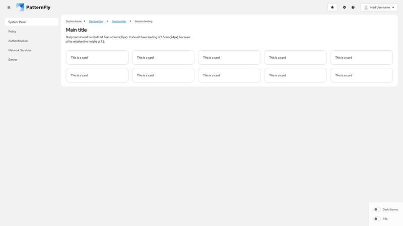
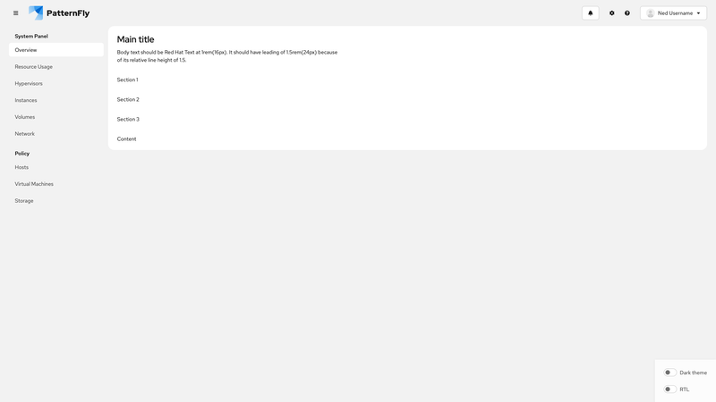
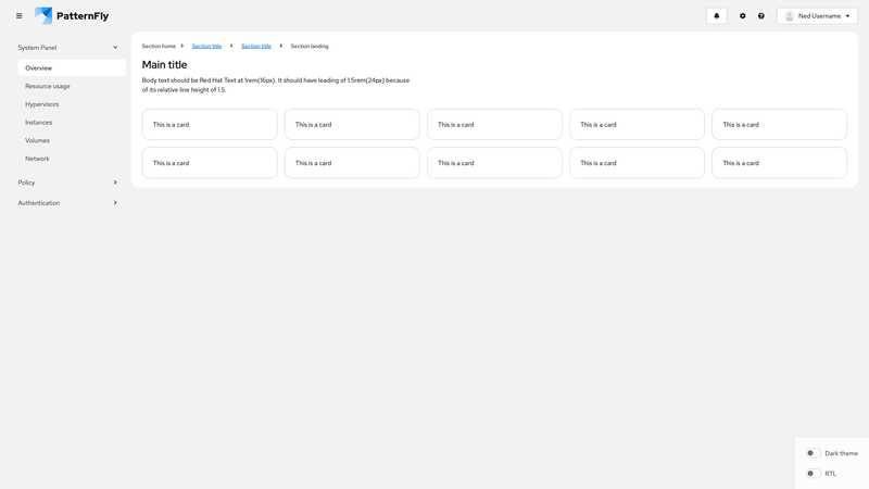
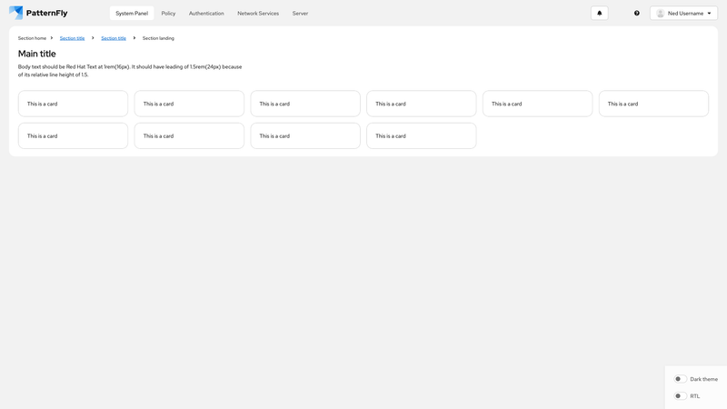
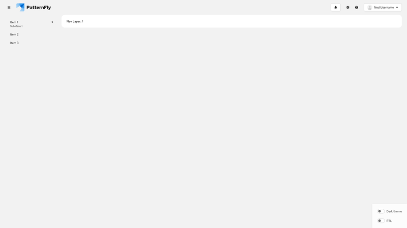
To save space in the UI, you can use docked navigation to replace text-labeled navigation items with relevant icons. On mobile (or narrow viewports), docked navigation appears as an overlay, while on desktop (or wider viewports) it displays as a persistent vertical sidebar that can toggle between icon-only and text+icon modes.
This demo includes the following features:
A page component with a docked layout, enabled via
variant="docked". Control the mobile overlay withisDockExpandedand the desktop label visibility withisDockTextExpanded.Two separate masthead components:
- Horizontal mobile masthead: Shown on small viewports using
display={{ default: 'inline' }}, with a hamburger menu toggle button, brand logo, and action buttons that should be immediately visible to users. - Vertical docked masthead: Uses
variant="docked"to create a thinner navigation sidebar with a hamburger menu toggle button, nav items, and action buttons.
- Horizontal mobile masthead: Shown on small viewports using
A navigation component with
variant="docked"and multiple<NavItem>components that must include both icons and text labels. To control text visibility,isTextExpanded={isDockTextExpanded}is passed to the<Nav>component.Button and menu toggle components, which use
isDockedandisTextExpandedto toggle between icon-only and text+icon styles. When the nav is docked, and only icons are shown, tooltips must provide full text labels for the navigation items, buttons, and menu toggles.A
<MastheadLogo>component that usesisCompactto show an icon-only logo when the dock is collapsed, and a full logo with text when expanded.
Note: For better keyboard accessibility, ensure that focus shifts between the hamburger menu toggle button in the mobile masthead and the docked overlay menu toggle button as the navigation is opened and closed.